Layout and Graphics

Layout:
It is a process of planning and arranging
graphics or text in a page or book.
A good layout should have a balanced make
up and alignment of elements.
1. Symmetrical:
There should be equal weights or elements
on both sides of the page.

2. asymmetrical:
It may be asymmetrical when there is an
artistic and different intensity on one side of the page.

3. text- the text type should be:
Legible
Appropriate font face
Left justified, right justified, or
centered
The flow of text should be easy to read.

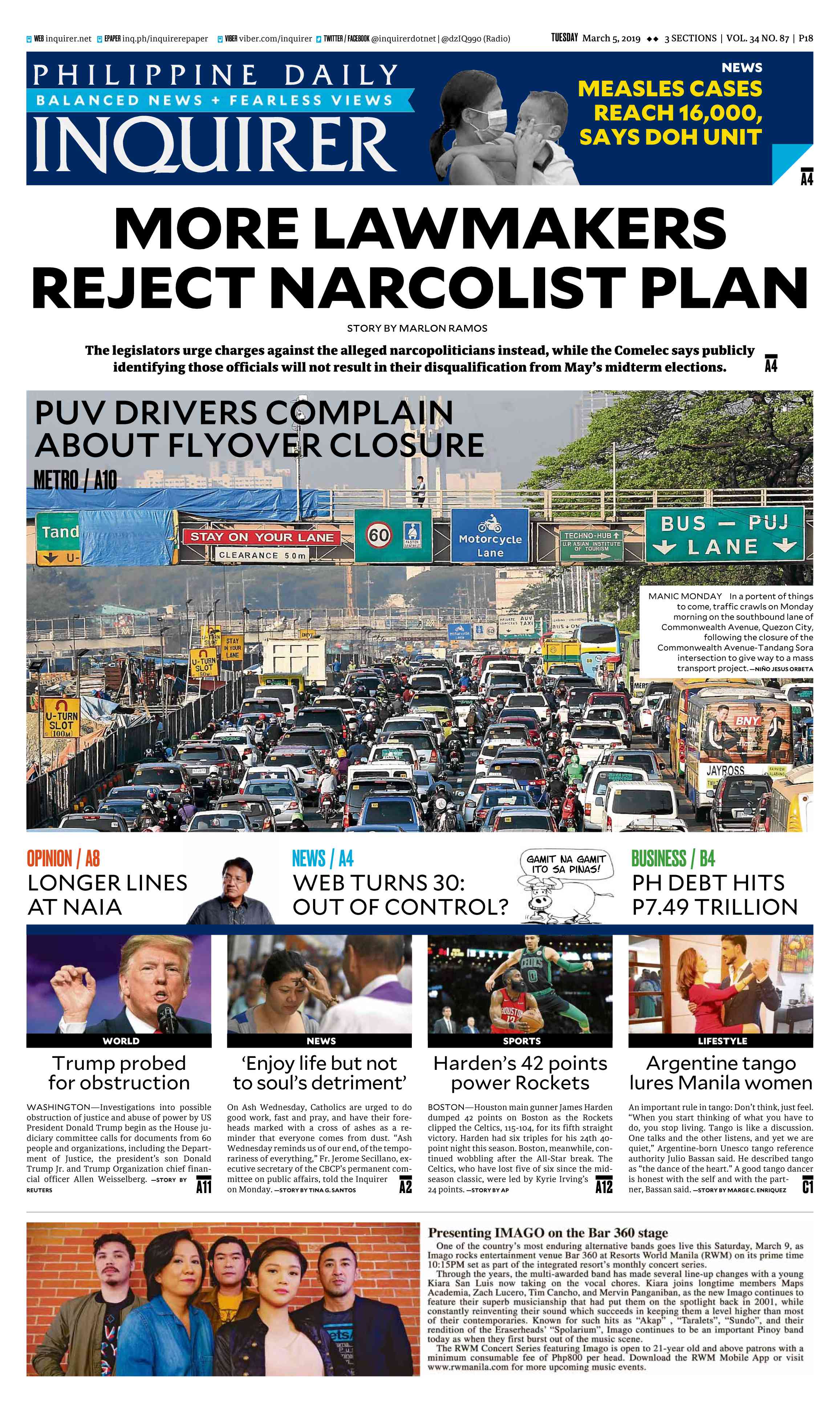
4. image- the image should be:
Proportionate
Sharp in color
With high resolution
With appropriate captions

5. proximity and harmony:
The elements should be close together and
scattered and arranged apart from each other. Elements should not be cluttered
and not compete with each other.
 6. consistency: there should be uniformity of theme on each
page.
6. consistency: there should be uniformity of theme on each
page.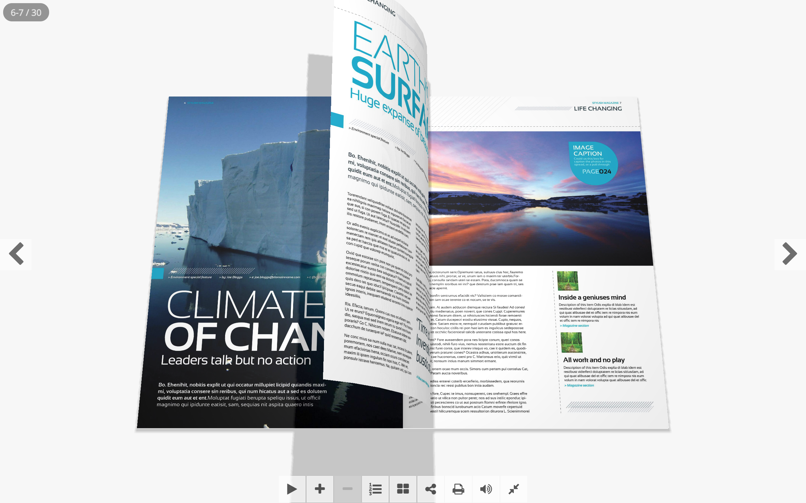
7. image: Use color to create interest by providing
variety in the design (color and contrast and shapes)
8. emphasis There should be one point of interest in a
page. The elements to be emphasized should have a different size, color, shape,
or background.


Comments
Post a Comment